Shopify Theme Review: Prestige
We review one of the most popular themes for luxury brands to understand why it works so well for high-end products and what to look out for when customizing it to your brand.

Introducing our Shopify theme, Primavera
Crafted with intention for modern luxury brands, Primavera is built on Shopify’s newest theme architecture and designed with accessibility as a first principle, not an afterthought.
Try for freeAs part of our series on the best Shopify themes for luxury brands, we’re kicking off with French design and development studio Maestrooo’s stunning Shopify theme, Prestige.
This article has been updated following the release of version 9.2.1 (March 2024).
| Created by | Maestrooo, a French design and development studio |
|---|---|
| Great for |
|
| Highlights |
|
| Drawbacks |
|
Design
Prestige is clean and minimal in design. It places product and editorial imagery front and center and features subtle animations that give it a polished feel.
It’s a design system that just works and requires minimum effort to look good.
As of version 8.0.0, Prestige added support for Shopify Color schemes. This feature allows you to define up to 21 color schemes, which are essentially a set of colors, and then easily apply them to different sections throughout the theme.
The theme’s typography settings are equally simple, but with a few extra settings added in more recently that are commonly requested by merchants. For example, you can now set letter spacing for headings, body text and buttons, as well as choose which font you want to use for buttons instead of them defaulting to the heading font.
Three presets
The theme comes with three presets which all add a different twist to the Prestige design system and shows what you can achieve for different types of aesthetics.
“Allure” is the more traditional of the three with its light gray background and uppercase headings.
“Couture” has a slightly more modern and airy feel.
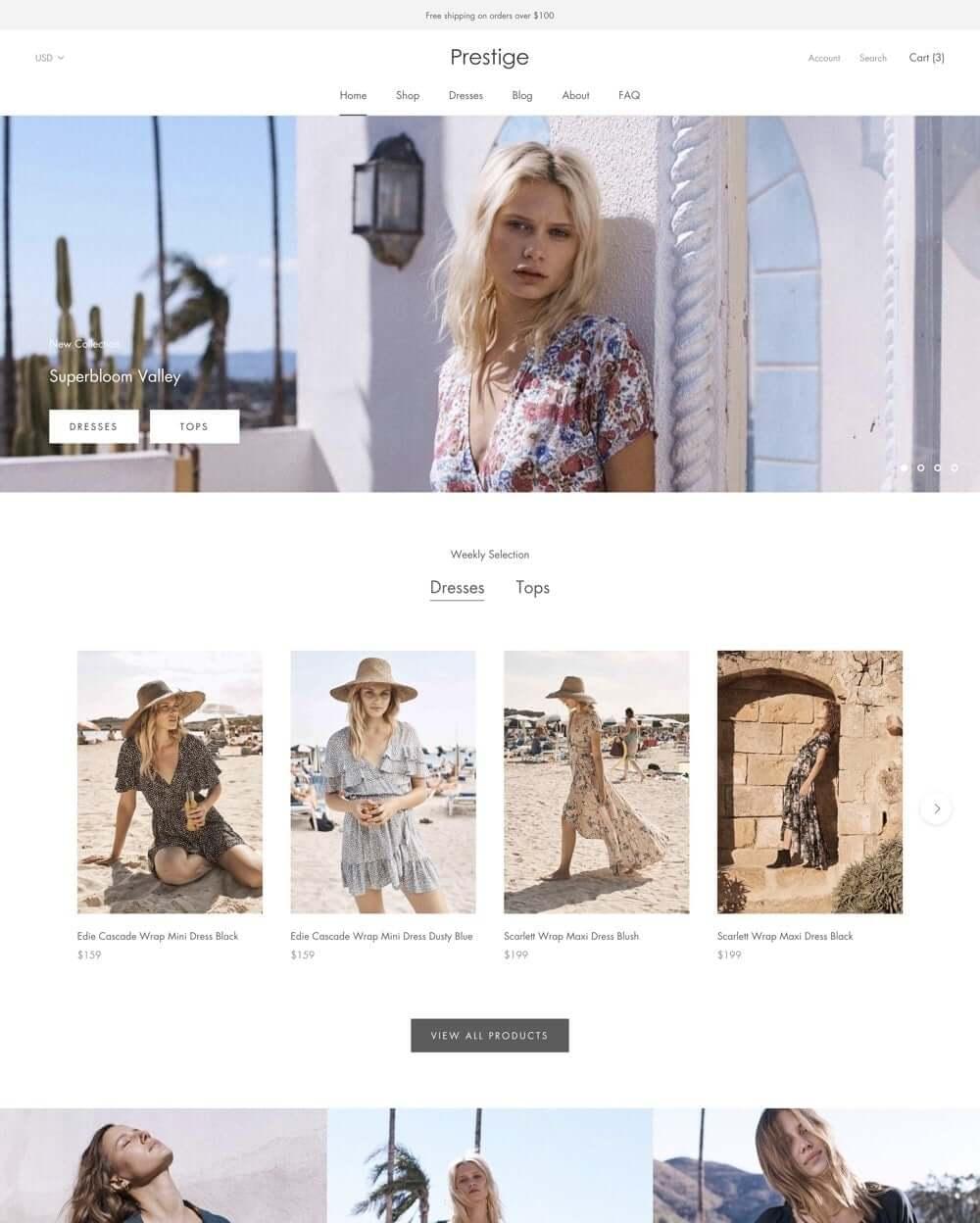
Couture preset
“Vogue” demonstrates how you can be a little more daring with your color palette with its light gold buttons.
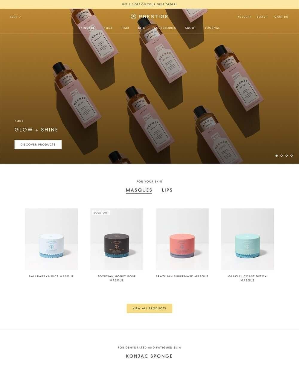
Vogue preset
Features we love
As well as the usual components and sections that you expect on a premium Shopify theme (announcement bar, slideshow, featured product, etc.) there are also a number of sections that make Prestige perfect for luxury brands in particular.
Mega menu
A mega menu is an expandable menu that lays out all the options in a given category instead of the user having to drill down into a more traditional tiered dropdown menu.
They are especially effective for larger sites with lots of categories as they allow users to quickly scan text and imagery.
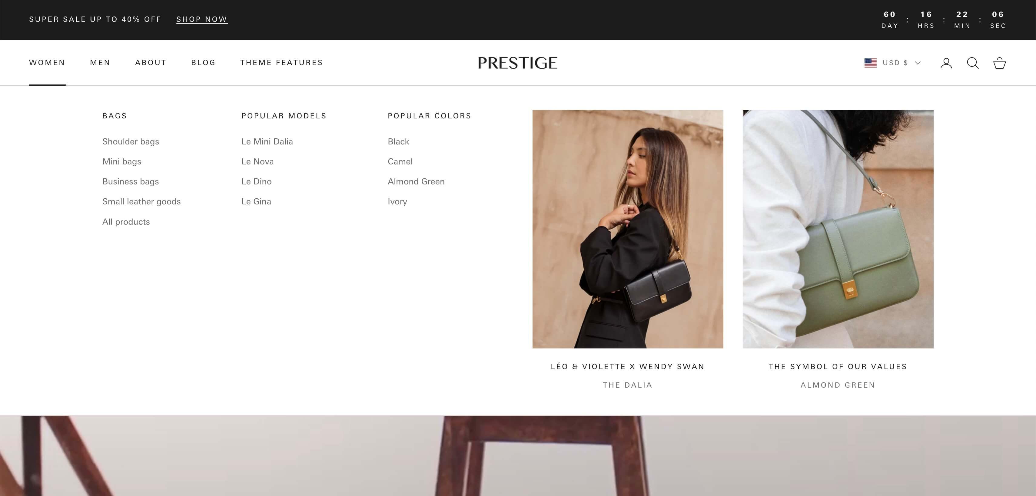
An expanded mega menu on the Allure preset
In the above example, we see a three-tier menu that would require the following set-up in the Shopify Dashboard:
- Tier 1: “Women” is the top-level link
- Tier 2: “Bags” is nested inside “Women”
- Tier 3: The links below “Bags” are nested inside “Bags”
Prestige allows you to create as many mega menus as you like; you simply specify to which top-level navigation link it should be tied in the Customizer and it replaces the default dropdown format.
Prestige also allows you to add up to two “Image push” blocks, where you can feature any image and text you like. These are great to draw attention to new products, collections or another feature.
Another feature is that the theme allows you to select a mobile-only menu (“Sidebar menu” in the Customizer), which is handy if you’re using mega menus since those may not look as good on compact screens.
Product media layouts
As of version 7.0.0, you can choose from 6 different layouts for the product gallery on desktop.
The default Grid (1 per row) layout is a sleek vertical image slideshow that reveals itself as you scroll, allowing customers to discover additional images effortlessly. This is important because research has shown that users often scroll right past slideshows, missing any content other than what’s shown in the first slide.
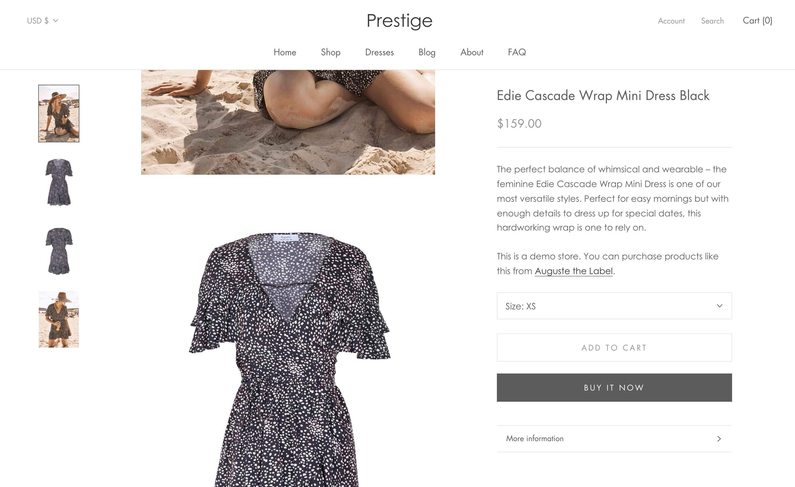
Vertical product slideshow on the Couture preset
On mobile the slideshow does become a traditional horizontal swipe experience, but with fewer elements on-screen and the pagination dots and chevrons clearly indicating that it’s interactive and which way to swipe, we feel that it’s a strong approach for mobile users.
Shop the look
The “Shop the look” section allows you to make editorial-style images shoppable.
This can be a single section or a slideshow of up to four shoppable looks. For each look, upload the image, then add up to three product hotspots.
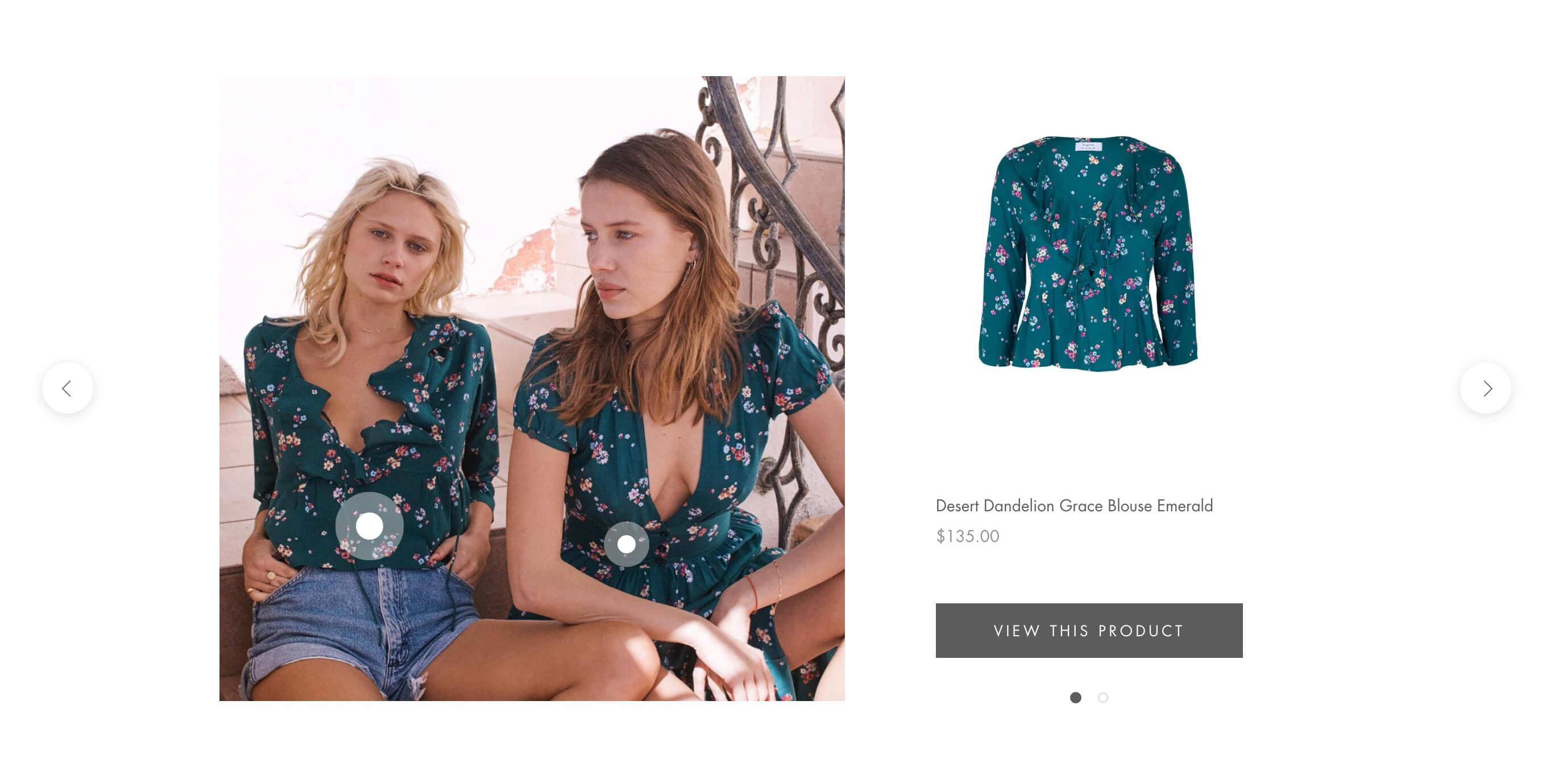
“Shop the look” on the Allure preset
Timeline
The “Timeline” section is great for telling the brand’s story. Luxury brands are built on their heritage, the stories of the women and men behind them, the inspiration and muses they found along the way. This section provides a neat structure to tell those stories.
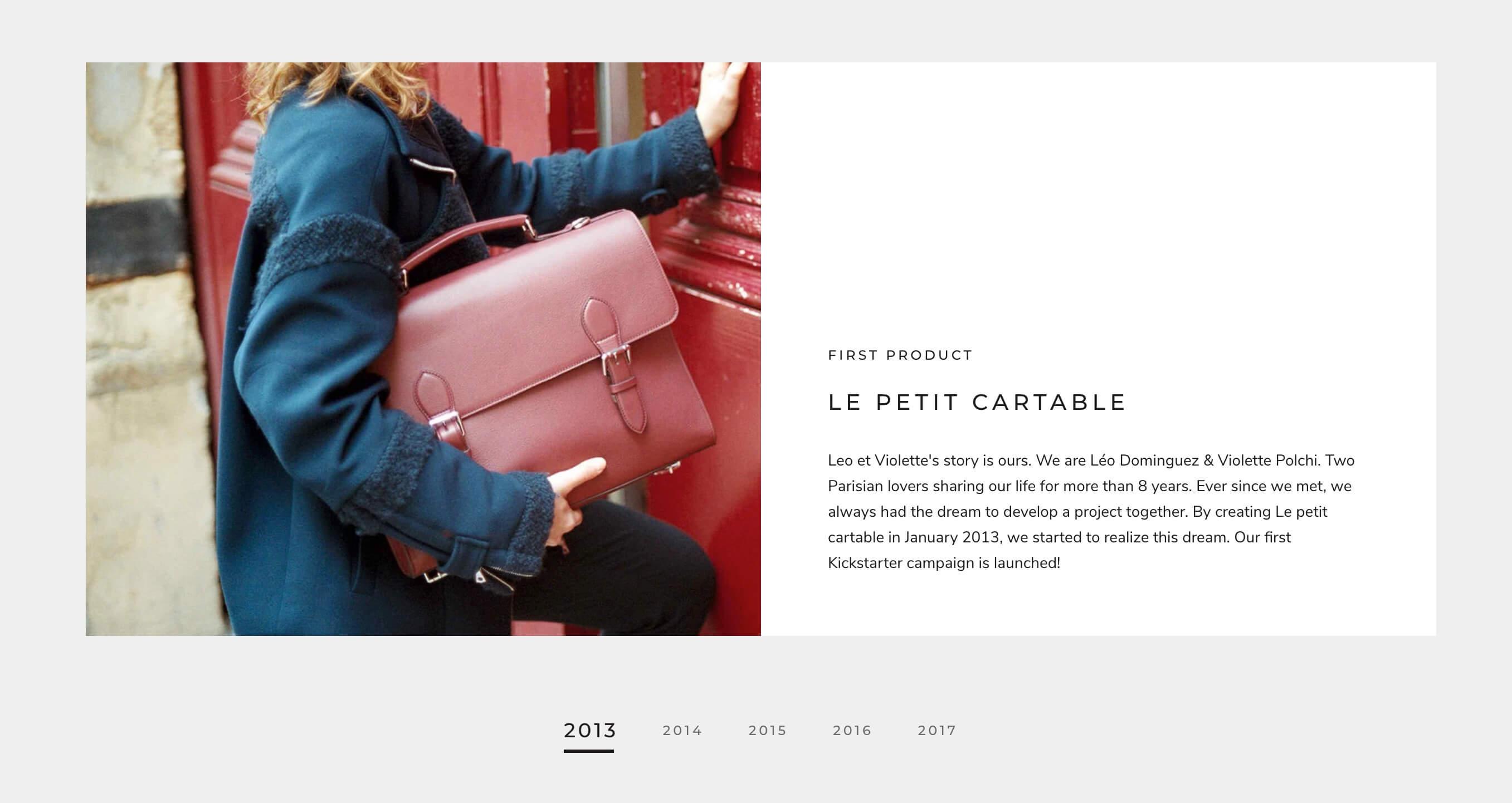
“Timeline” on the Couture preset
Recently viewed products
The “Recently viewed products” is a powerful feature that’s commonly seen on larger e-commerce websites. It keeps customers’ attention on the products they have looked at (and therefore shown an interest in), and also removes any friction once they do decide to go ahead and purchase it since it’s just a click away.
Color swatches
Note that as of version 9.0.0, the theme fully supports Shopify’s upcoming native color swatch feature (learn more here). Until it’s fully rolled out to all mechants, however, you can follow Prestige’s manual configuration instructions below. Do look out for updates on the native swatch feature though as it will make it even easier to configure swatches.
When enabled, the legacy functionality converts the default variant selector to color swatches instead. This is really useful for products with multiple colors, textures or finishes.
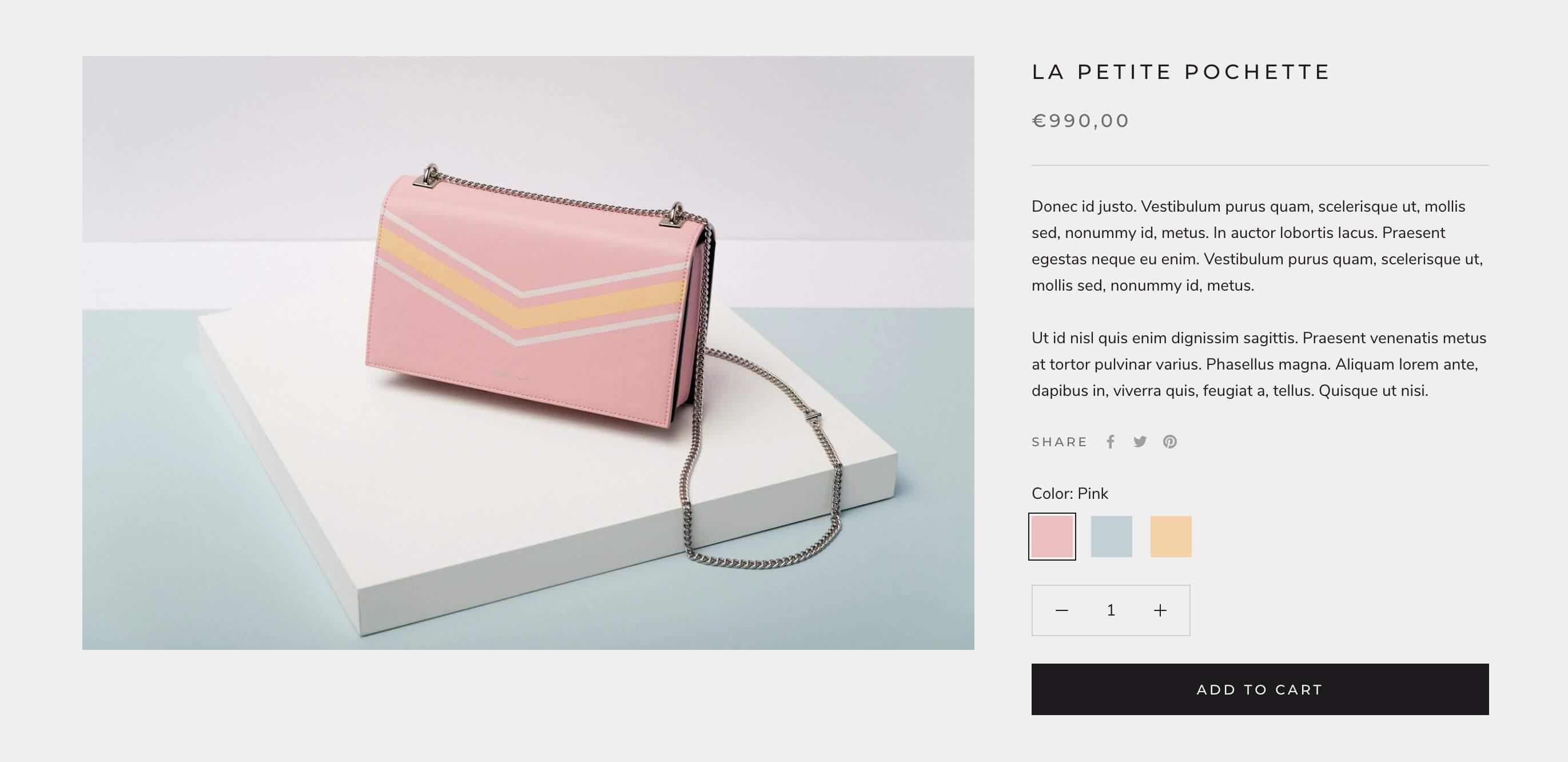
Example product with solid color swatches (photo credit: Creative headline )
To enable swatches on the product page:
- For relevant products, ensure that the color option name is “Color”
- In the Customizer, on the Product page under Variant selector, check “Show color swatch”
Prestige allows merchants to display either solid colors or small images that are representative of the texture or finish.
How to add custom swatch colors
By default, Prestige looks at the color name of the variant and then displays the corresponding CSS color, so if the variant is “Green” then it will be this green.
If these default colors don’t match the product color IRL, you can add custom colors for each color name. Open Theme settings, look for the Color swatch setting and add each custom color on a separate line.
The syntax for each color name is as follows:
Pink: #7A7CBA
How to add custom swatch images
Alternatively, if a solid color doesn’t represent the product accurately, you can upload small PNG images to your theme.
The file name should be lowercase, match the exact option name and spaces should be converted to dashes. Here are the full instructions.
When it comes to colors, don’t hesitate to ask for input from different eyes – we’re always amazed at how differently we perceive colors!
Complementary products
Also on the product page, the Complementary products block.

“Complementary products” on the Couture preset
This functionality allows you to display up to 10 complementary product directly on the product page. It’s powered by the Shopify Search & Discovery app.
Options include desktop display location (below the gallery or below the rest of the product form on the right) and the ability to stack products instead of displaying them in a slideshow.
Product inventory
The Product inventory block available on the product page is also great for high-end products, since they are usually produced in lower volumes and that sense of scarcity can really add to the desirability of the product.
Countdown timer
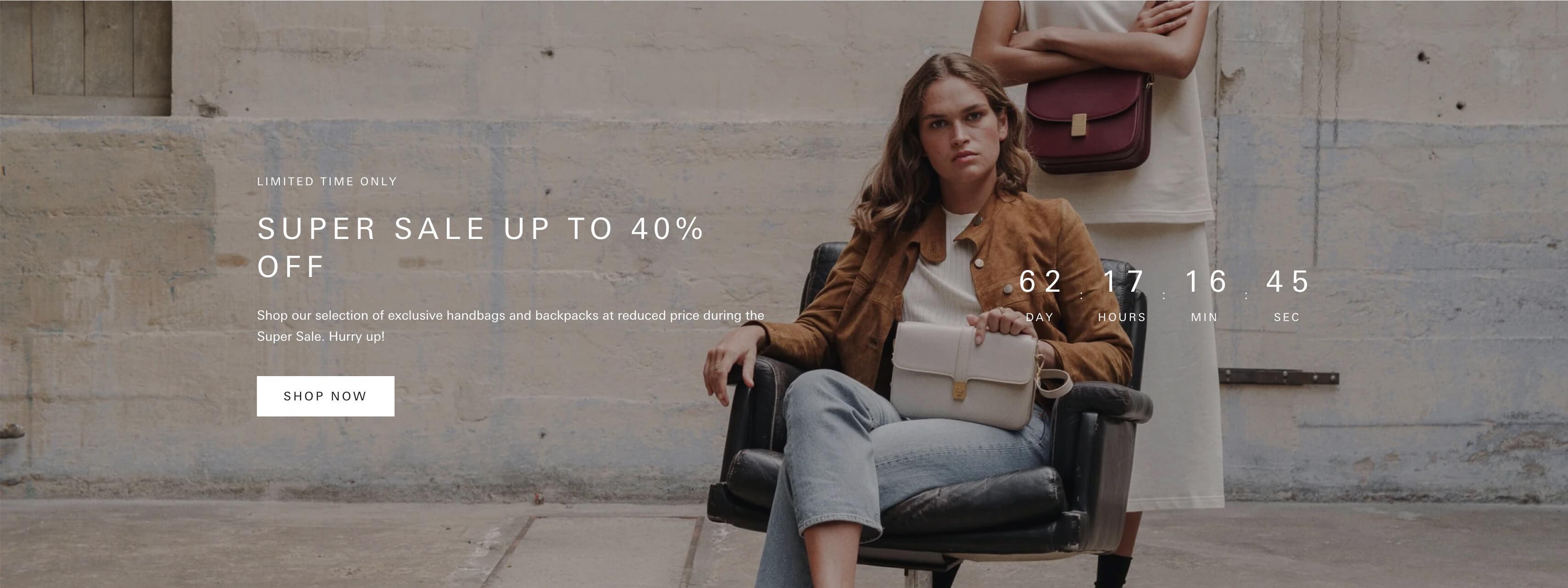
Screenshot of Countdown timer on Allure preset
This is a great section that was added with version 7.0.0. It allows you to display a countdown timer for a given event that you want to promote and create a buzz around.
The section settings even allow you to choose what happens when the timer reaches zero: either leave the timer at zero or hide the section entirely.
The team behind Prestige have also strived to make this section as accessible as possible by hiding the timer itself from screenreaders and providing an aria-label that explicitly states when the offer expires.
Image with text scroll
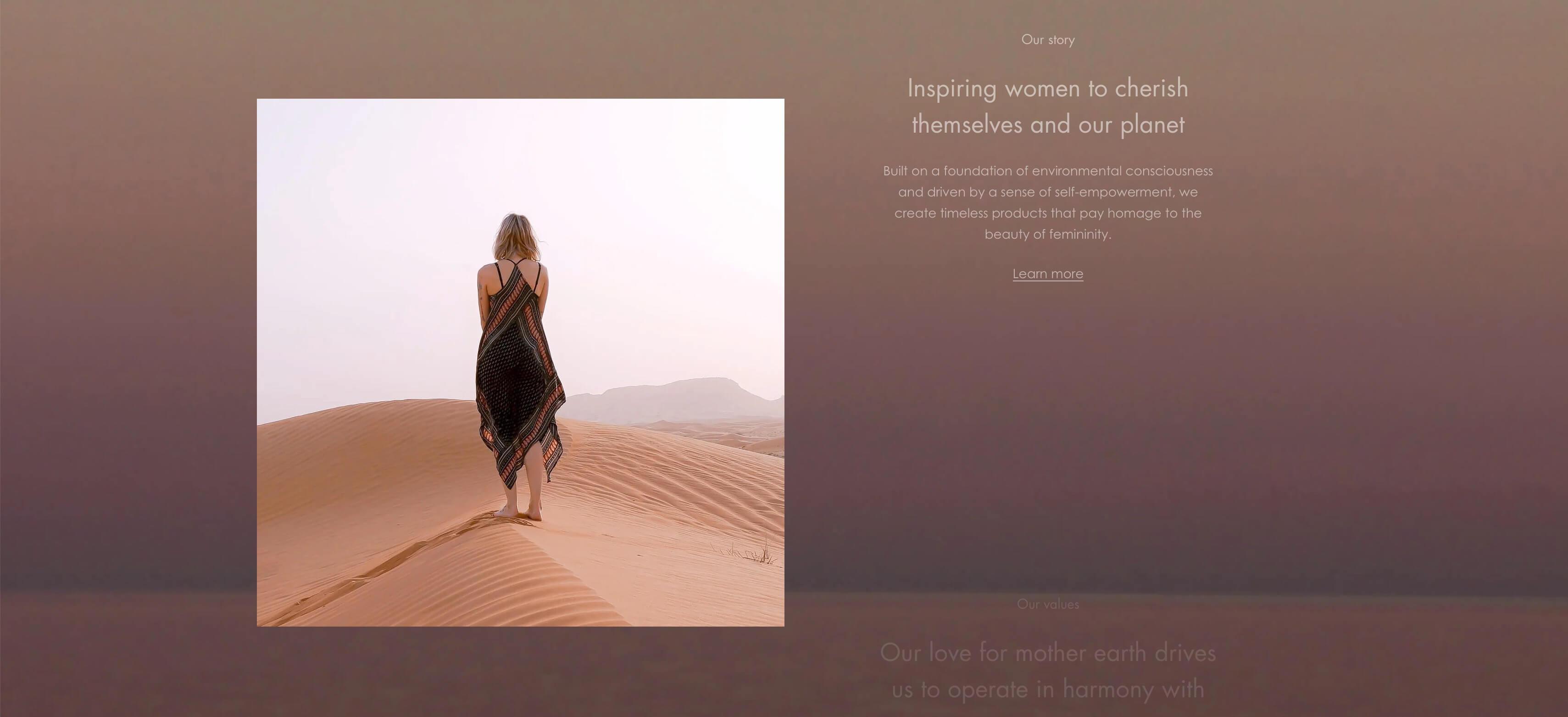
Screenshot of Image with text scroll on Couture preset
This section, added with version 7.0.0, offers another way to tell your brand’s story. As the customer scrolls down the page, the text slides up elegantly and the relevant image fades in.
The settings allow you to choose a background image or leave it as a solid color.
Scrolling content

Screenshot of Scrolling content Couture preset
This is a section introduced in version 7.0.0 that allows you to display a scrolling marquee. What sets this section apart from other themes like prestige is that you can also add images within the scrolling content.
While efforts have been made to make this section accessible by adding aria-hidden="true" to each of the cloned content blocks so they’re not read out multiple times on screenreaders, some improvements could be made as we would like to be able to allow users to interact with and pause the section.
Following our feedback, the Maestrooo team has told us that this will be addressed in the upcoming 9.3.0 version. They will also ensure that the section does not automatically scroll when the customer has reduced motion enabled.
Text with icons

Screenshot of Text with icons
This section was also a welcome addition to version 7.0.0. We often found ourselves custom-coding something like this for our clients since it’s such a common design element.
In the screenshot above, the section is used to create what we call a “reassurance banner”. Usually located right above the footer, it serves to succintly inform shoppers about your customer-friendly policies and address any doubts they might have about making that purchase. If customers know about your fast delivery times, your flexible returns policy and that your customer experience team is on hand if they have any issues, they’ll be far more likely to convert.
However, the section can also be used to create any section that requires up to 5 columns of images with text, e.g. steps in processes (“How it works” section below).
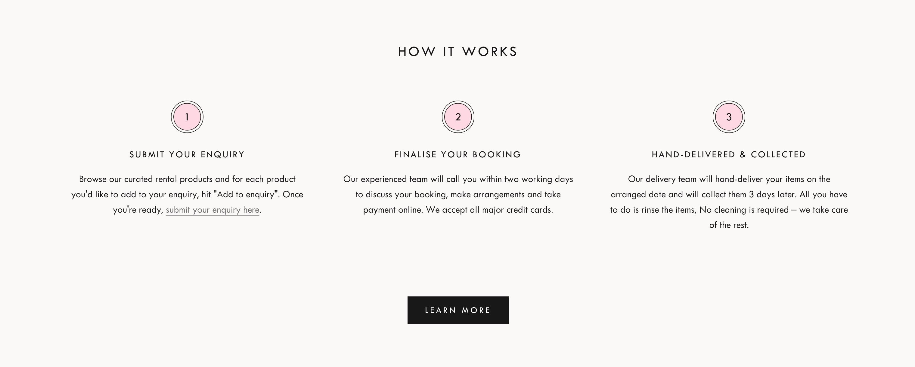
Screenshot of a custom Text with icons section we built for The Social Kitchen
Newsletter popup
Prestige has a built-in “pop-up” functionality that allows merchants to display text and/or a newsletter sign-up form.
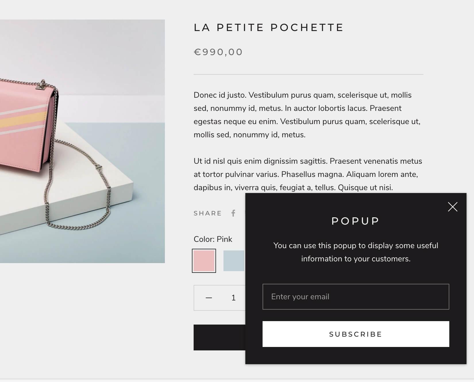
“Pop-up” on the Allure preset
Note that this newsletter form by default creates the customer in your Shopify Dashboard with the relevant Accepts Marketing attributes (it also adds a newsletter tag to those customers). You can then sync your subscriber list to your e-mail marketing platform. Here are the instructions for Klaviyo.
What’s great about this pop-up is that it’s unobtrusive – especially on desktop – and it’s quite obvious how you can dismiss it, which is great for customer experience.
That being said, it’s important to note that search engines can penalize intrusive pop-ups on mobile, especially when the pop-up is displayed permanently and/or displayed to all visitors. Here’s a Q&A video of Google’s John Mueller on the topic.
Luckily Prestige offers settings to choose where and when to display the pop-up, but we always advise merchants to tread carefully with pop-ups and make sure that they’re actually enhancing the customer experience.
A luxury product speaks for itself through its beauty and craftsmanship – there is no need to talk over it.
On a related note, luxury sales are all about the “soft sell” approach. A luxury product speaks for itself through its beauty and craftsmanship – there is no need to talk over it. Pop-ups and shouty headlines can erode the image of a brand, so we recommend extra caution for brands that serve high-end customers.
Technical
With each version of Prestige, the Maestrooo team have made leaps and bounds in terms of technical excellence and performance.
Performance
Shopify sites can be slowed down by all manner of things, from apps to Facebook pixels and everything in between.
Thankfully, Shopify takes care of some big-hitters for us: they leverage browser caching, provide a world-class Content Delivery Network and enable automatic CSS and JavaScript minification, Gzip compression and JPG compression for all their merchants.
But there’s so much more that impacts a website’s performance. How do we evaluate Prestige itself among all these moving parts?
Let’s start with the Liquid
Liquid is the templating language used in Shopify themes. It creates a bridge between the theme templates and the Shopify store data, allowing for dynamic content to be inserted on-page.
Poorly-written Liquid such as excessive loops and conditions can impact the time it takes to render the Liquid. A good tool to evaluate code quality is the Shopify Theme Inspector tool, which allows us to measure a given page’s total time to render Liquid.
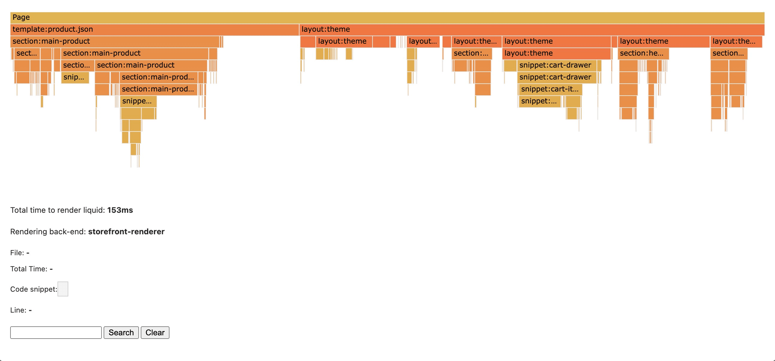
Example profile on Shopify Theme Inspector tool
We compared Dawn, Shopify’s own Online Store 2.0 theme, to Prestige’s Allure preset, with no content added except for default sections and blocks, and found that the average total time to render Liquid was actually faster on Prestige: the average load time was 155ms compared to 177ms on Dawn.
Of course this metric is heavily reliant on the type of sections and blocks that are in use, and also varies slightly each time a page is profiled since the rendering depends on Shopify’s servers. To get as close to a fair test as possible (and because we fancy ourselves as armchair scientists), we did carry out three measurements per key page and averaged those out.
Handling images
When it comes to poor performance, images are often the biggest culprit. While Prestige can’t prevent us from uploading a huge, oversized image (though Shopify will protest at 20MB), it does have some solid precautions in place to optimize for performance.
For example, it uses resolution switching, which allows the browser to choose different image sizes dependent on the screen width.
The theme also provides recommended image sizes in the Customizer to gently remind us to upload a large enough image, but not so large that it slows everything down.
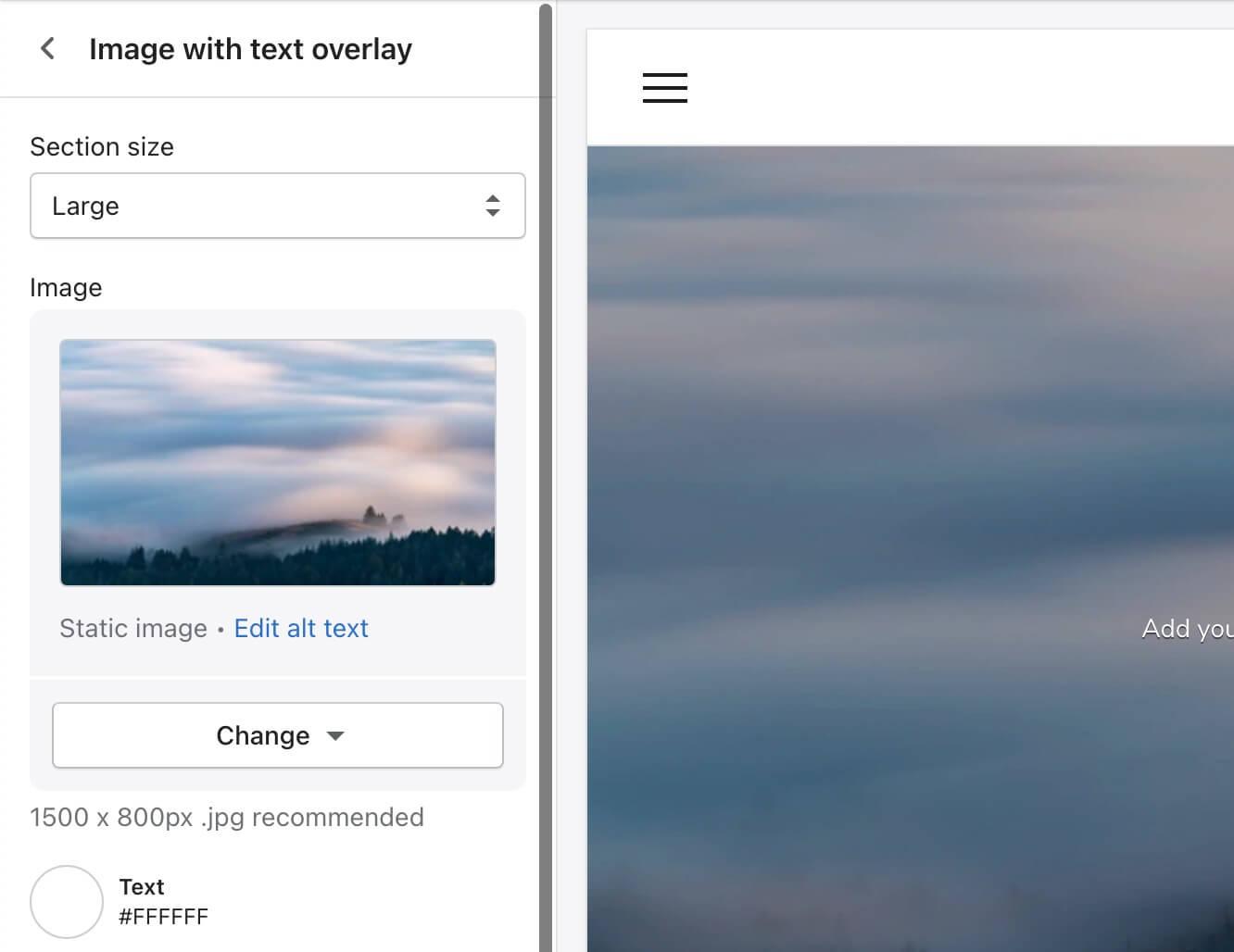
Example of Prestige's recommendations for image sizes
Render-blocking resources
By default, resources such as stylesheets and scripts (specifically, those loaded in the head of the document) delay the rendering of a page while they are being downloaded. However, many resources aren’t actually critical and can be downloaded asynchronously instead.
Prestige does a good job of loading non-critical scripts asynchronously, however the theme’s CSS is loaded in a single file synchronously. We spoke to Maestrooo about their approach and they have us convinced: they conducted experiments with asynchronous loading and it had a significant effect on Cumulative Layout Shift, a stable Core Web Vital metric that measures visual stability on a page. Instead they’re focusing on keeping their CSS as small and efficient as possible, and at under 27kb we have to say we agree.
Slideshows
As of version 9.2.0, a new setting was added to the Slideshow section that allows you to toggle the initial transition on and off. This was introduced following one of the team’s tests where they found that disabling that initial transition reduced Largest Contentful Paint, another Core Web Vital metric that measures perceived load speed, by 40%.
In view of this finding, the initial transition will be disabled by default from version 9.3.0, though merchants can still choose to enable it if they prefer to prioritize animations over performance.
Ongoing performance measures
Prestige provides a solid base performance-wise, but the rest really is up to each individual merchant. Here are a few tips for maintaining your Shopify store’s performance post-launch:
- Take great care when adding new apps as these can often have a big impact on performance. Consider partnering with a developer to build a custom solution instead, or ask the developer to assess the app before installing it.
- Systematically resize and compress images before uploading them (bookmark TinyPNG now if you haven’t already!).
- Think through new content to avoid unnecessary slideshows, large images, videos or worse – GIFs. Every element you add weighs down the website, so choose carefully.
Accessibility
The Maestrooo team has made great efforts to ensure that key content can be comfortably navigated by screen reader or keyboard alone.
For example, it’s possible to access all the content in dropdowns and mega-menus in the header, and focus is both visible and logical. The product page can be navigated and interacted with by keyboard alone. They have also added screen reader-only labels when additional context is needed, such as in the language dropdowns.
Since this article was first published, we’ve also seen a few key improvements that we initially raised:
- Fonts are now set in relative sizes (
rems), which means that the text adapts to each user’s browser preferences. - We’ve also seen updates to the theme that adapt to users’ system-level motion preferences. This setting is for users who get motion sickness or discomfort from animations on the web and who wish to indicate that they prefer reduced motion.
There are still some areas for improvement: the Before/after image section doesn’t appear to be accessible as you cannot access or manipulate the slider button by keyboard alone, and we’d also like to see some changes to the Scrolling content section.
However, following this article, the team behind Prestige has told us that the Before/after image section will be controllable by keyboard alone in the upcoming 9.3.0 version.
Progressive enhancement
Progressive enhancement is the practice of building websites using the most basic of Web technologies so that they work for as many users as possible. Newer technologies can of course be used to enhance the experience, but the basic functionality of a website should work without those.
One example of that is ensuring that a website works without JavaScript, a programming language used to create dynamic functionality on websites (e.g. open/close a mobile menu or fetch and display data from elsewhere).
Historically, this has been important for Shopify themes and developers were encouraged to build fallbacks to ensure that users who have JavaScript disabled could at least carry out key tasks on the website, e.g. interact with navigation, add to cart.
However, as of March 2024 there has been a paradigm shift at Shopify driven by the fact that Checkout Extensibility (Shopify’s upgraded checkout) requires JavaScript. We also hear that a number of new Shopify features (e.g. Combined Listings) will rely on the section API to work properly.
Maestrooo have always done a great job of ensuring that the majority of Prestige’s functionality is available to users who have disabled JavaScript: products can be discovered, added to cart and purchased.
And, despite the recent changes at Shopify, they told us that they’ll continue to do so where possible. As Michaël Gallego, co-founder at Maestrooo, explained to us, “I’ve found that ensuring everything works for JS forces to use as much as possible native features and, therefore, improves performance”.
In summary
Prestige is a high-quality theme that allows luxury brands to quickly and easily showcase their products and tell their story.
It’s particularly effective for brands that have stunning high-resolution images, providing an elegant and solidly-built stage for the products to speak for themselves.
The theme is well-built and continually being improved upon. The team behind it are clearly passionate about quality and knowledgeable about best practices, and they have been very responsive to some of the areas for improvement we’ve highlighted in the past.
It is a popular theme so give it your own twist to stand out, or use it as a solid base for your own custom design.
