Shopify Theme Review: Broadcast
As part of our ongoing series on the best Shopify themes for luxury brands, we’re turning our attention to Broadcast, a stunning and surprisingly versatile Shopify theme built by the talented team at Invisible Themes.

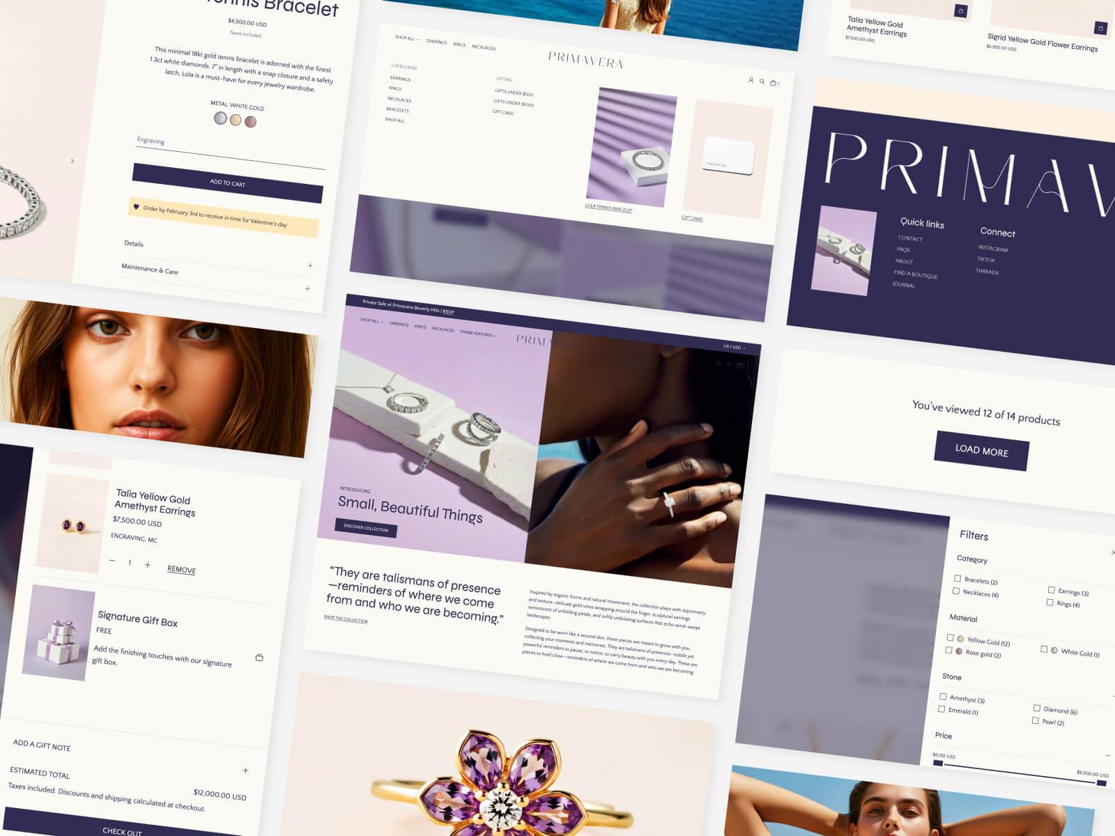
Introducing our Shopify theme, Primavera
Crafted with intention for modern luxury brands, Primavera is built on Shopify’s newest theme architecture and designed with accessibility as a first principle, not an afterthought.
Try for free| Created by | Invisible Themes , a remote-first team based across Canada, the US and Europe |
|---|---|
| Great for |
|
| Highlights |
|
| Drawbacks |
|
Design
Broadcast is minimalist with a few artistic flourishes – our favorite kind of minimalism. The theme makes clever use of space, contrast and grid alignment to create a sense of order in what must have been a complex design brief.
As well as adhering to design best practices, the theme also provides some more playful layouts such as the Text with products or Collection list hover sections:

Text with products section
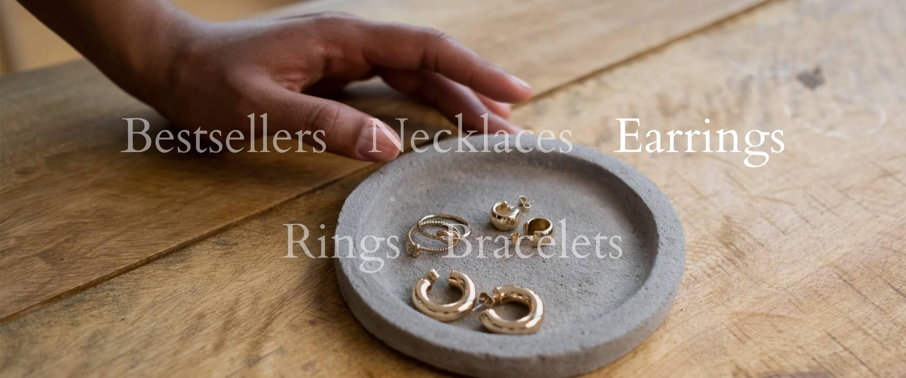
Collection list hover
With their bold use of type, creative use of images and subtle animations, these sections are what elevate Broadcast as a particularly impactful theme for high-end brands.
And with luxury brands still struggling to project their creativity and attention to detail onto a digital canvas, getting high-quality design like this for a cool $300 USD is a feat.
With luxury brands still struggling to project their creativity and attention to detail onto a digital canvas, getting high-quality design like this for a cool $300 USD is a feat.
Four presets
Presets showcase how a single theme can be adapted to different branding styles and product categories.
While merchants could select a preset, add some content and technically launch their store, we highly recommend spending some time customizing the theme to their specific needs. This is not only to stand out from their competitors, but also because the design and features that work for one audience may not work for another.
Let’s talk through each of Broadcast’s presets and highlight why they work particularly well for their use case.
Clean
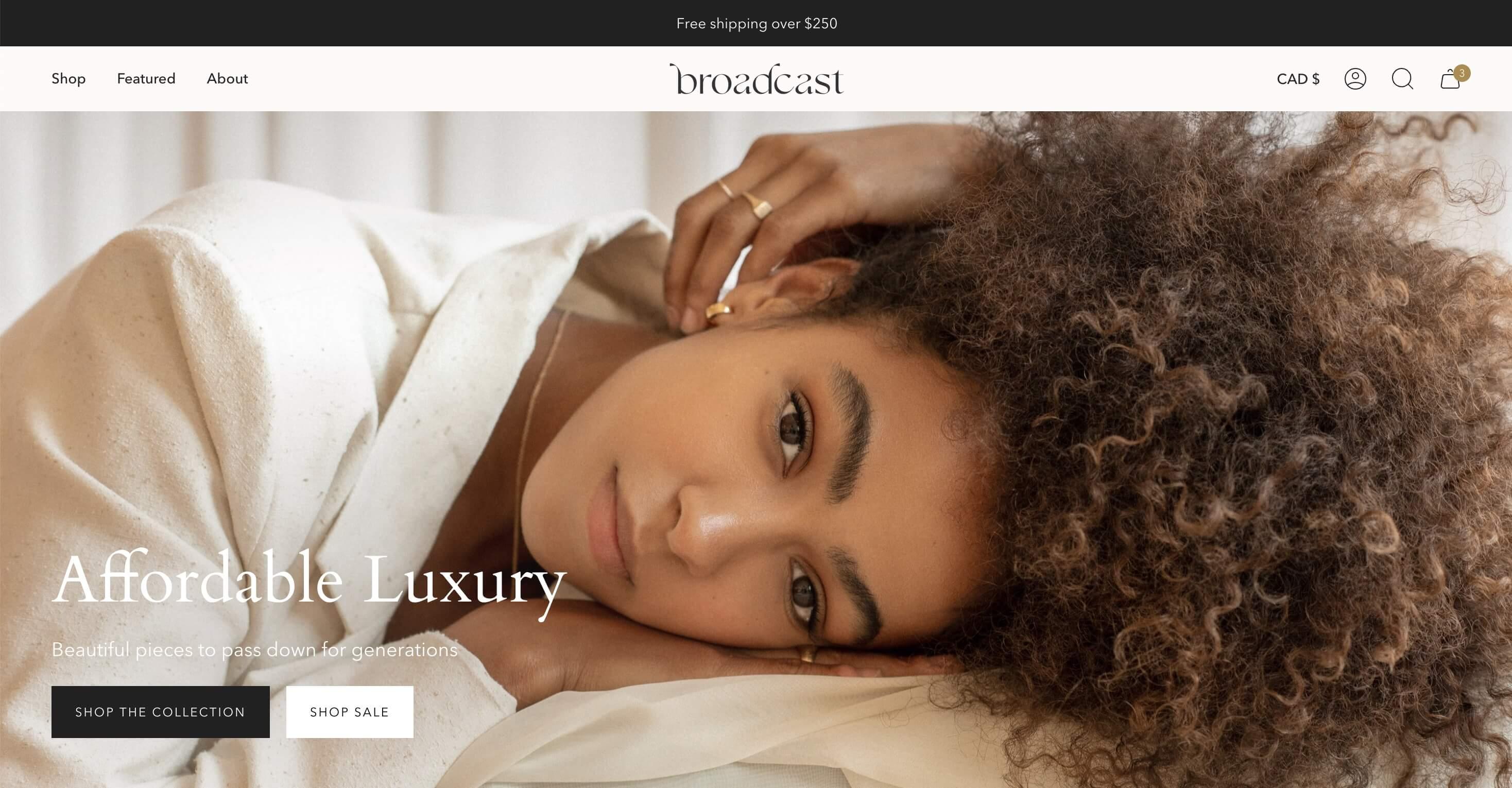
Broadcast's Clean preset
With its bold and sometimes supersized serif heading font, this preset is a great example of a classic luxury aesthetic with a modern twist.
The clean grid with ample spacing makes it easy to take in and navigate, as does the very slight color contrast between sections.
While the color palette may seem neutral at first glance, the stone and sand accents throughout the site work especially well for monochromatic products such as jewelry. If your products come in a variety of colors, however, it may be worth considering a less opinionated color palette – just like our next preset.
Modern
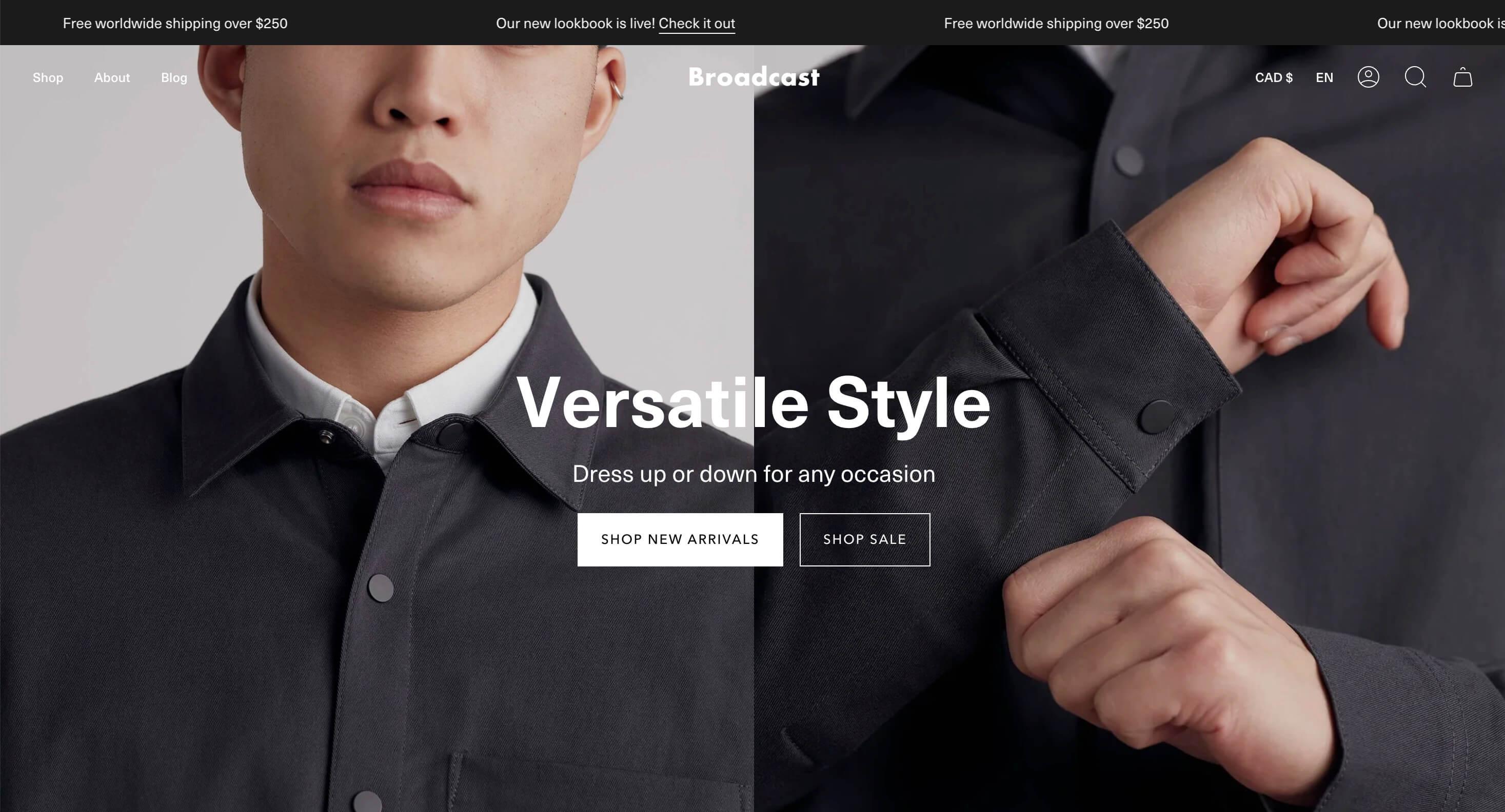
Broadcast's Modern preset
The black and white color palette here works really well with product lines that come in a variety of colors.
When starting a new fashion brand or marketplace, it is tempting to distinguish yourself with an elaborate color palette. However, unless you’re a beachy linen brand that only ever sells products in natural tones or you only sell accessories in hues of pink, we recommend sticking with the tried-and-tested black and white approach. Take a look at all the major fashion brands and you’ll notice that the imagery usually brings the color – not the other way around.
The sans-serif heading font and the full-bleed images in this preset all contribute to an altogether more “modern” interpretation of luxury.
Take a look at all the major fashion brands and you’ll notice that the imagery usually brings the color – not the other way around.
Bold
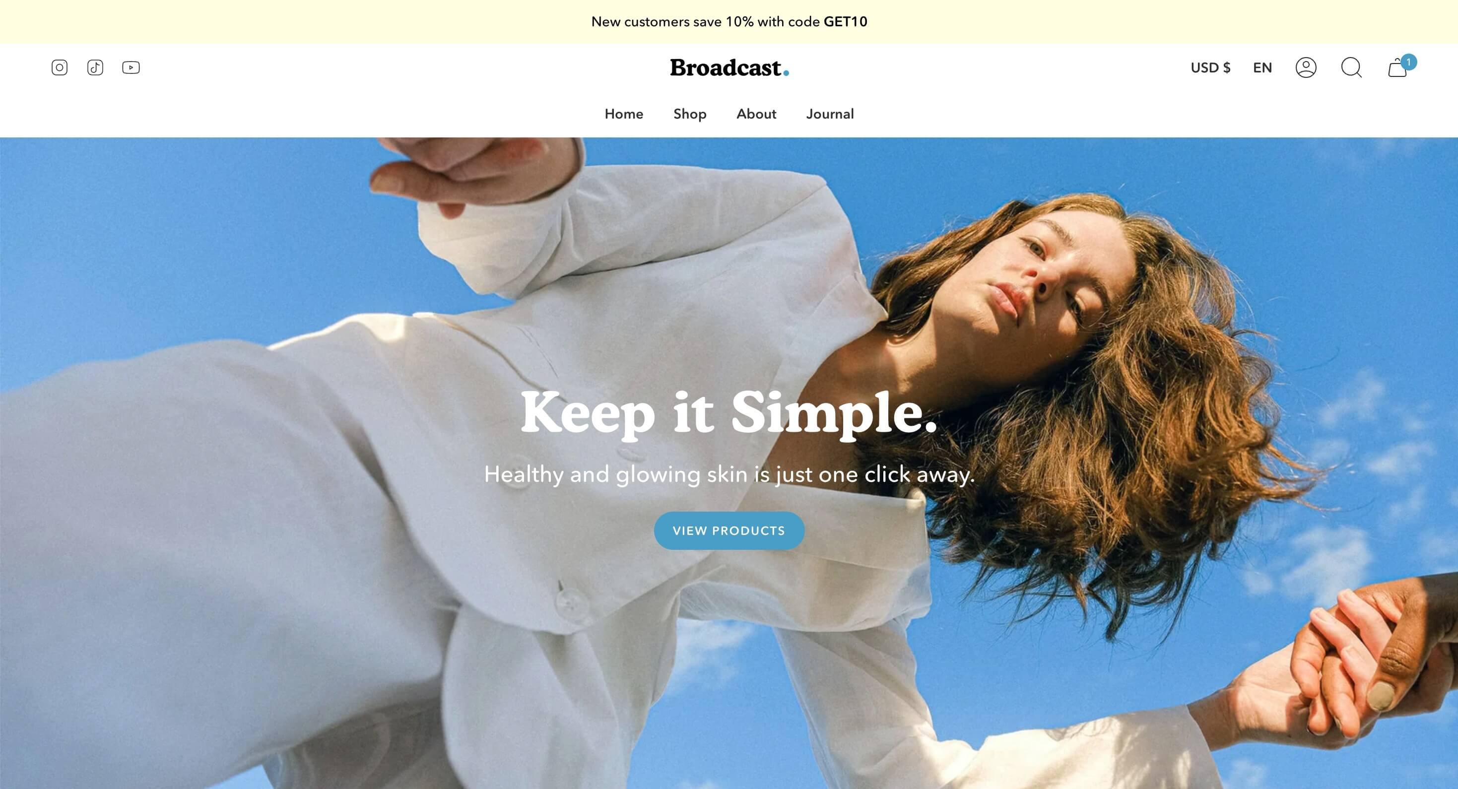
Broadcast's Bold preset
This isn’t our favorite preset but it works well for products such as technology and skincare where the main focus isn’t necessarily the design of the product, and a splash of color and personality might be needed to keep the customer engaged.
Bright
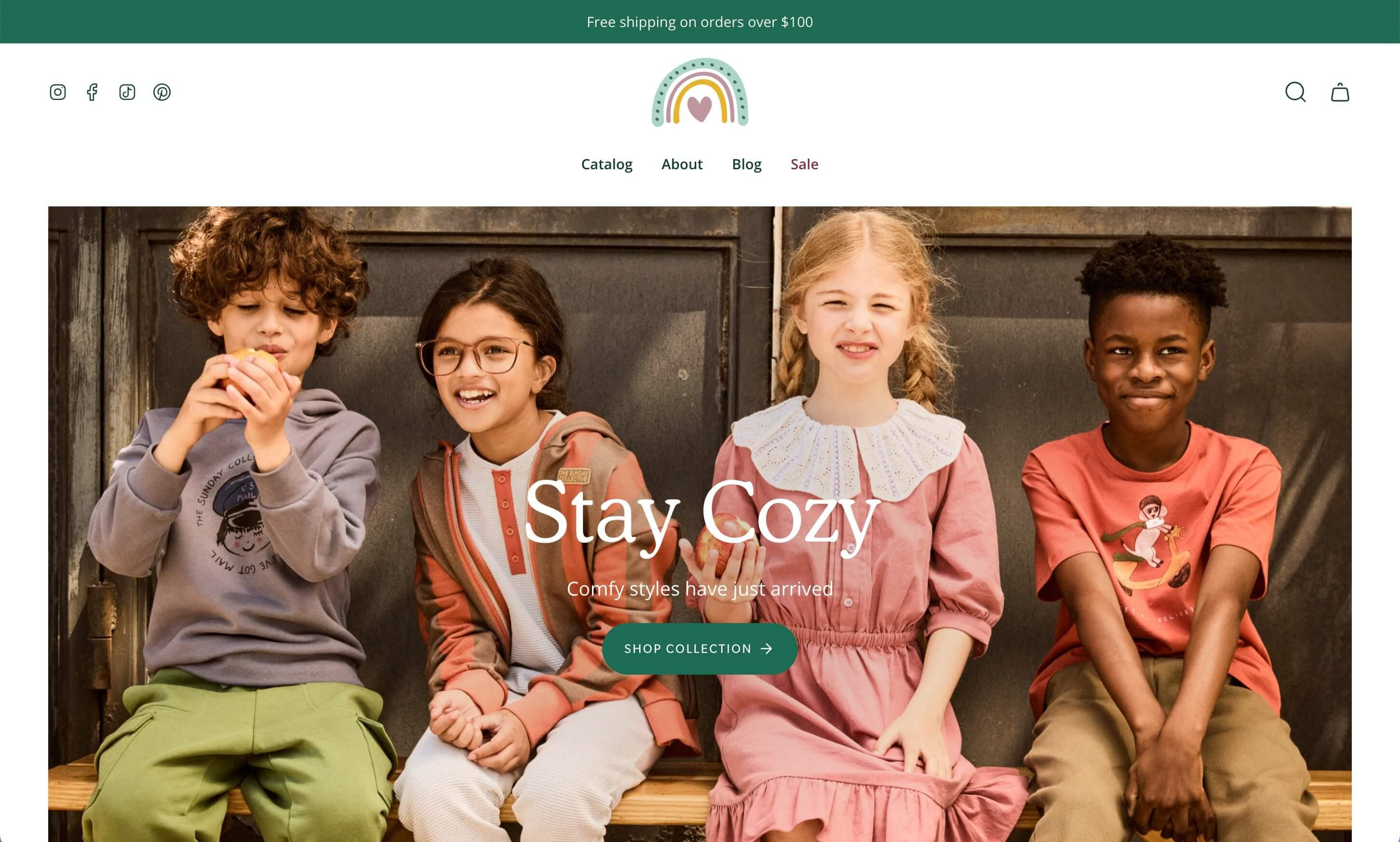
Broadcast's Bright preset
This preset is a good example of how color can be used for brands that sell products in multiple hues – so long as the colors are consistent and complementary.
This childrenswear brand favors organic colors and materials, which is why the pine green and muted pink accents work so well here. The colors of the clothes are even echoed in the logo, tying it all together visually.
Another great example of this is Olipop, where the palette is determined by that of the product range.
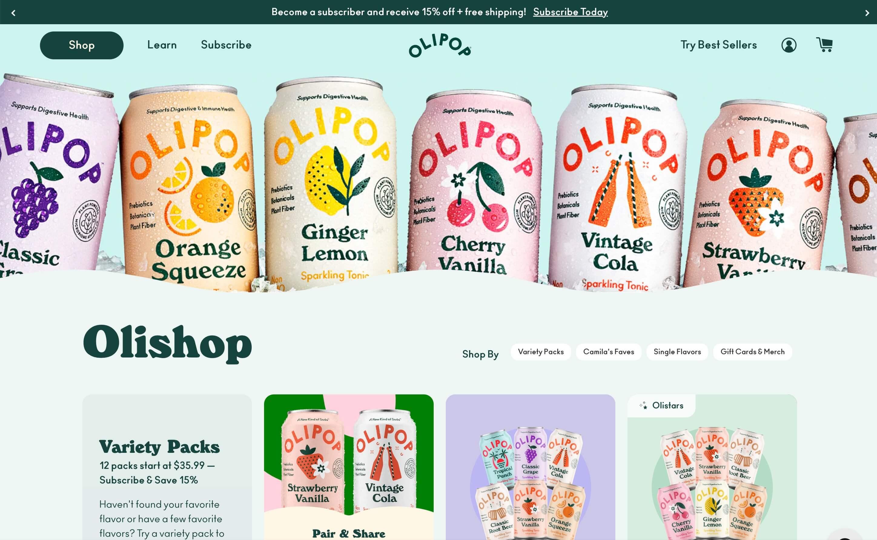
Colors are great – so long as those colors are consistent and complementary across the product range
Typography-wise, the Bright preset pairs the big and bubbly Cooper BT with an easy-to-read Open Sans body font, conveying warmth and openness.
Now that we’ve looked at the different ways you can style Broadcast, let’s dive into the specific features and functionality that make this theme so effective.
Features and functionality
Broadcast is so rich in features that we’d be hard-pressed to tell you everything we love about it. Here are the features that stand out to us the most:
Announcement bar

Still of the marquee announcement bar
This small sliver of text at the very top of websites is commonly used to inform customers about promotions or other friction-removing information such as free shipping and returns. However, merchants might have different types of messages to display and there’s very little space to fit all of them in.
Broadcast solves this by allowing you to add multiple messages that can be displayed either as a slider or a marquee, both with autoplay (the text scrolls across the top of the customer’s screen). This is one example of where Broadcast can replace an app.
For more classic luxury brands, we recommend sticking to a static single message as the autoplay and multiple messages could be perceived as a little pushy. To achieve this, in Customizer > Announcement bar, select the “Slider” option under Layout and then ensure there is only one Text announcement block.
Header
Mega menu
With Broadcast, you can either combine menus with images or display only images:

Menu with images: Here we see a three-tier navigation menu alongside one image block

Image-only megamenu: This creates a more visual browsing experience
The ability to add several images is quite unique to Broadcast as a lot of themes restrict the number of images per mega menu. With Broadcast, you’re basically getting two very different layouts with just one section. Clever.
Mobile navigation menu
On mobile, Broadcast allows you to display a secondary menu of text links just below the main header.
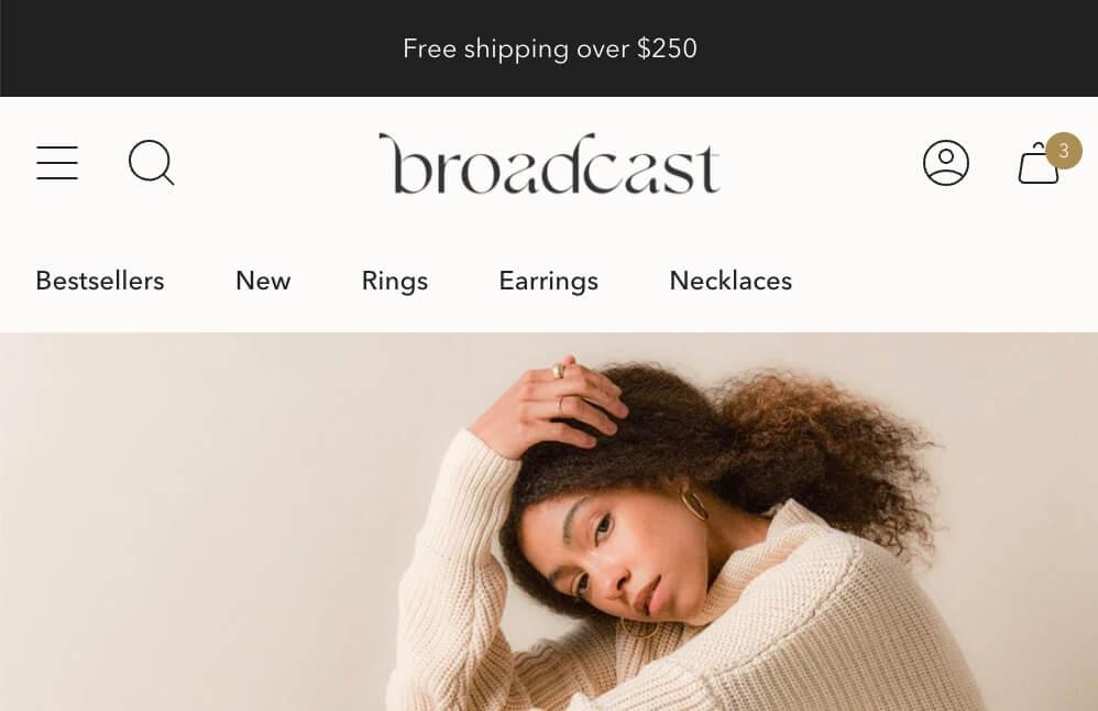
In this mobile example some text links display below the header, in addition to the hamburger menu
Why is this useful? Because while the debate over whether hamburger menus are effective continues to rage, Nielsen Norman Group suggests displaying a short menu as visible links on mobile.
If your main menu is too long, we suggest creating an abridged version of your main menu with just 3–4 links, then leaving the full menu in the main hamburger menu.
Header highlight link
This setting allows you to make a specific link in the navigation a different color, for example if you wanted to make the “Sale” link red:

In this screenshot, the “Sale” menu item has been highlighted with a discreet red color
This is a good example of how Broadcast excels at distilling small but powerful UI patterns that would usually need to be hand-coded by a developer.
Collection template
Subcollections
For collections that are a little more general, such as “View All” or “Sale”, it can be useful to add a Subcollections section above the product grid.

Screenshot of a subcollections-type section on Reformation
This row of categories allows customers to quickly identify the category that interests them, instead of them scrolling down the page and losing them with a potentially irrelevant and overwhelming number of options.
To make a Subcollections section appear on a specific collection:
- Head over to Online Store > Navigation
- Create a new menu that shares the same name as your collection, e.g. for the Subcollections section to appear on your “Clothing” collection, name the menu “Clothing”
- Add a menu item for each collection you want to display on the “Clothing” collection
- Click on Save menu
There are a number of settings available in the section which are documented in more detail here.
Collection cutlines
This is a small but useful feature that allows you to add a second line of text per product in the grid view (e.g. collections or search).
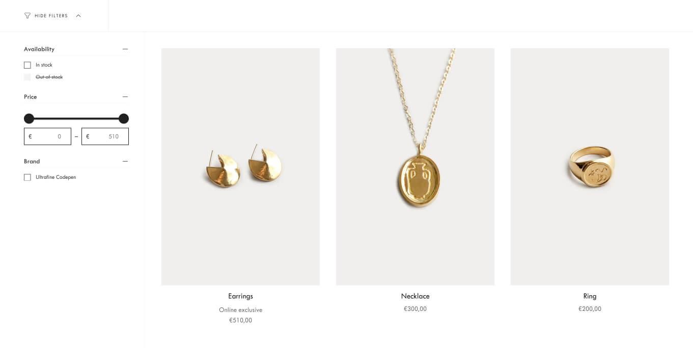
In this example we’ve added “Online exclusive” as a cutline to the Earrings
Collection cutlines are quick to set up: you just need to create the Product metafield on your store and then add the metafield value for any product you’d like a cutline to display for. Here are the full instructions.
Product template
Upsell vs. Complementary products
These blocks might be a bit confusing because they seem so similar. Basically they both allow the customer to buy different products within one product page, and they both open a sleek variant chooser when the product has variants.
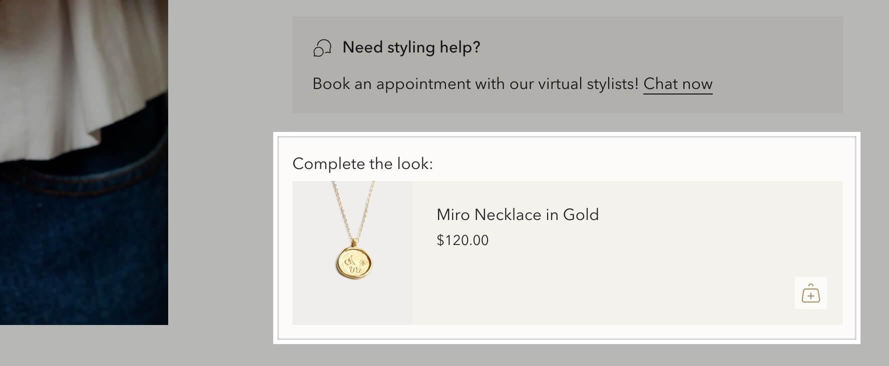
The Upsell block allows customers to buy a separate product from one product page
The key differences between the Upsell and Complementary products blocks are:
- The Complementary products block allows you to list up to 10 products instead of just one
- The Upsell product also appears in the cart to give the customer another opportunity to add it to cart
- They’re configured differently (more on this below)
To implement the Upsell block in versions 3.4 and up
- Create the product metafield:
- Go to Settings > Custom data
- Click into Products
- Click on Add definition
- Enter any name, e.g. Upsell
- Enter namespace and key
theme.upsell - Select type Product
- Then, for each product you’d like to display an upsell, scroll down to the metafield and select the upsell product
- In the Customizer, add the Upsell block to your Product pages section
To implement the Complementary products block
- Install Shopify’s free Search & Discovery app
- Open the app, click on Recommendations
- Click into the product you want to add recommendations for
- Under Edit complementary products, click on Browse and select up to 10 products
- Click on Save
- In the Customizer, add the Complementary products block to your Product pages section
As always, we recommend keeping the number of products relatively low to avoid overwhelming the customer.
Siblings
This is the feature you don’t realize you need until you really do – and a custom implementation of this can cost you a pretty penny.
The problem: Shopify has a limit of 100 variants per product, and each product can only have up to 3 options. This means that if you sell jeans in Petite, Regular and Tall, and you have each of these available in 3 colors and 7 sizes, you’re kind of stuck.
The solution: Create a separate product for each color (still with the other variants like size and fit) and follow Broadcast’s step-by-step instructions on how to connect sibling products so that the colors appear as swatches on the product form.
The instructions might seem a bit technical at first but if you’re willing to do a bit of legwork upfront, this is a feature that will save you a lot of time and effort.
If you’re willing to do a bit of legwork upfront, this is a feature that will save you a lot of time and effort.
Inventory countdown
This is a useful block that can be added to your product form to communicate urgency and encourage the customer to take action.

Example of the Inventory countdown block
For high-end brands we would opt for a more soft-sell message. The wording can be edited in the language editor.
Line item property
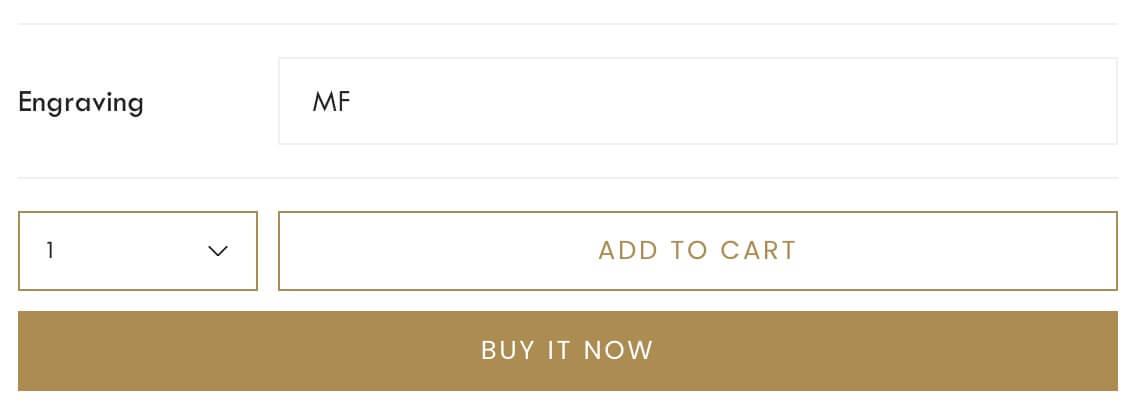
Screenshot of an “Engraving” line item property added via the Customizer
This is another small feature that often needs to be custom-coded, even though it’s a requirement that comes up regularly.
If you have a product that needs some level of personalization, e.g. engraving of initials, or you want to offer options that don’t affect the price, e.g. color of packaging, with Broadcast you can easily add a field to your product page to capture that data.
The value entered by the customer will be displayed alongside the product in the cart and checkout, and you as the merchant will be able to see it in the admin. Note you may need to edit your customer and internal notifications to include the line item value on those though.
Broadcast allows you to select between simple text, a checkbox or a dropdown (up to three dropdown options).
Cart drawer
We love Broadcast’s Cart drawer. It’s tidy yet has a number of features that can really increase AOV and drive conversions.
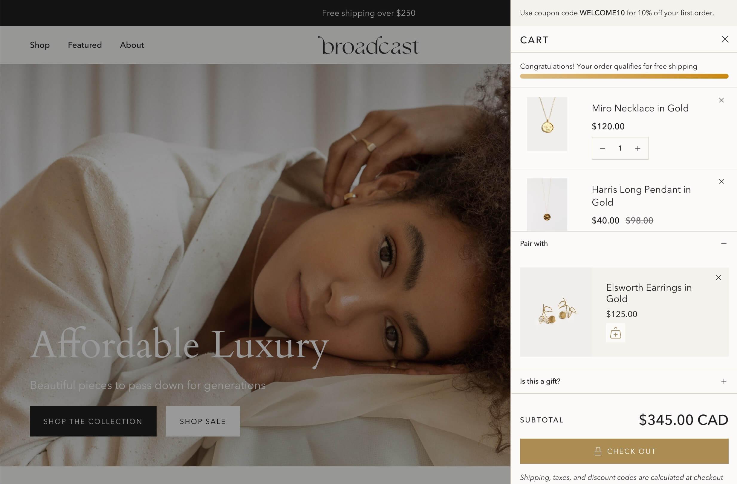
Broadcast's Cart drawer
We’ve already mentioned the Upsell block that appears both on the product page and in the Cart.
Cart message
In the above screenshot, you’ll also see the small message at the top of the screen – another opportunity to remind customers about a promotion or gently nudge them towards checkout.
Free shipping message
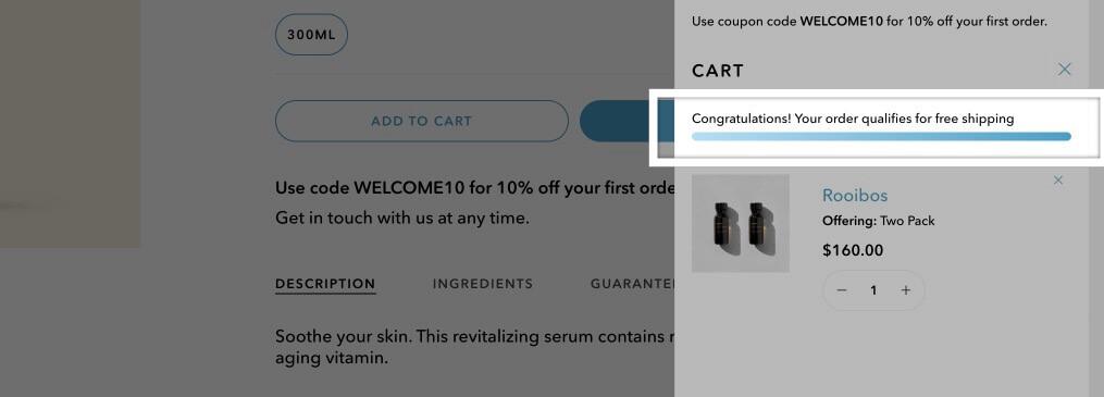
Broadcast's Free shipping message
This small section in the Cart drawer is great for reminding customers about your free shipping threshold and encouraging them to keep shopping until they reach it.
To change the amount, wording and/or the color of the progress bar, go to Customizer > Theme Settings > Cart.
When changing the wording, remember to leave || amount || as is because this is what the code uses to dynamically calculate remaining spend. You can change all the words around that though.
For higher-end brands, you might consider disabling this setting as the progress bar design could be a little too pushy. Alternatively, you can ask your developer to hide the progress bar and leave only the text.
Search
With Broadcast, you can customize the empty Search modal to help customers find what they’re looking for or guide them towards your most popular products before they even start typing their search term.

Broadcast displays Popular searches and Popular products when customers first open the Search modal
In Theme settings, you can choose which links appear under Popular searches (create a menu and then select it in the Customizer), as well as the products that appear under Popular products.
Then, when the customer starts typing their search term (and so long as search suggestions are enabled on the theme, which they are by default) suggestions start appearing below, both as a list on the left, and in the product grid on the right.
This functionality relies on Shopify’s own predictive search API, but as usual it’s how Broadcast displays that information and creates an engaging empty search layout that sets it apart.
Cookies pop-up
This is another feature that could save you an app install. It uses Shopify’s consent tracking API to only start collecting marketing and analytics data after the EU/EEA/UK/Switzerland-based customer has consented via this sleek pop-up:
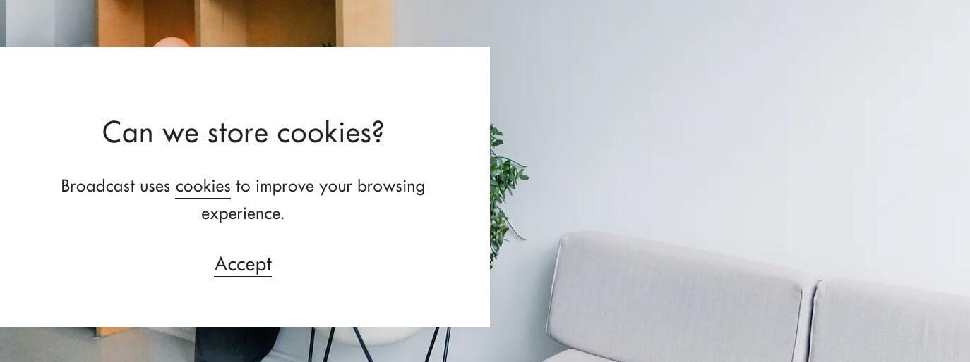
Broadcast's Cookies pop-up
You can also have it as a discreet bar at the bottom of the screen, or pinned to the right instead.
For this to work, you must first go to Online Store > Preferences > Customer privacy and ensure the Collected after consent option is selected.
And very importantly, this is only related to the data collected by Shopify – not your own analytics or data collected by apps or other third-party services. Note that you may need an additional app for customers residing in the US.
Loading icon
This is a lovely little feature that allows you to have a brief pulsating image, logo or icon against a plain background on page load.
You can see an example of the Loading icon on Broadcast’s Clean preset demo store
Designers will love it, developers will hate it. But on this occasion, the developers win and we do not recommend using this feature.
Here’s why: if your customers don’t have JavaScript enabled (between 1% and 2% of users could be navigating the web without JavaScript), then your website will be completely frozen on this screen. Customers will literally not be able to interact with your site. So that’s a no from us for now.
Designers will love it, developers will hate it. But on this occasion, the developers win.
Tab collections
Now we’ve done a tour of the key templates and theme settings, let’s move onto global sections that can be added to any page, like this beautiful Tab collections section.
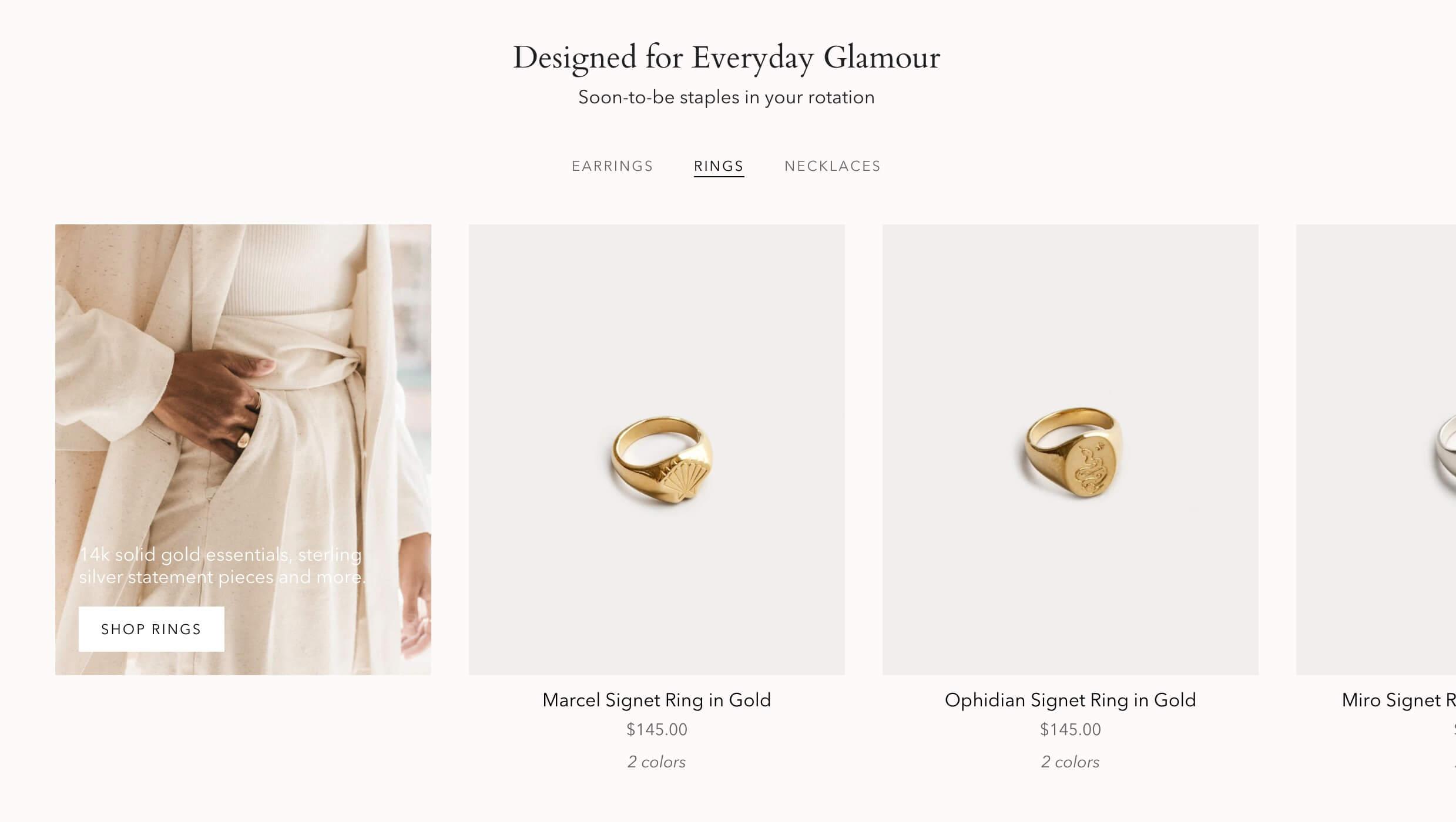
An example of Tab collections on the Clean preset demo store
We love this kind of design because it allows you to showcase some of your best products in a compact way while allowing the customer to quickly find what they’re looking for.
There is the risk that the customer might miss the clickable tab titles, however this design pattern and the horizontal scroll grid are commonly used.
Custom content
If you’re comfortable in the Customizer, this section really allows you to get your creative juices flowing.
This is where the endless possibilities of the theme really become apparent. This section is made up of two blocks of your choice which display as a split-screen on desktop and then stack up on mobile. Block options include Image, Text, Newsletter, Testimonial, Product, Video, Collection or Before and after.
If you’re comfortable in the Customizer, this section really allows you to get your creative juices flowing. Why not have a video on the left and a still of the video with a link to the product on the right? How about highlighting a customer testimonial alongside an image of the reviewer? You could stack these Custom content sections on top of eachother to create a stunning content grid, zig-zagging the images and text down the page for maximum engagement.
Before and after
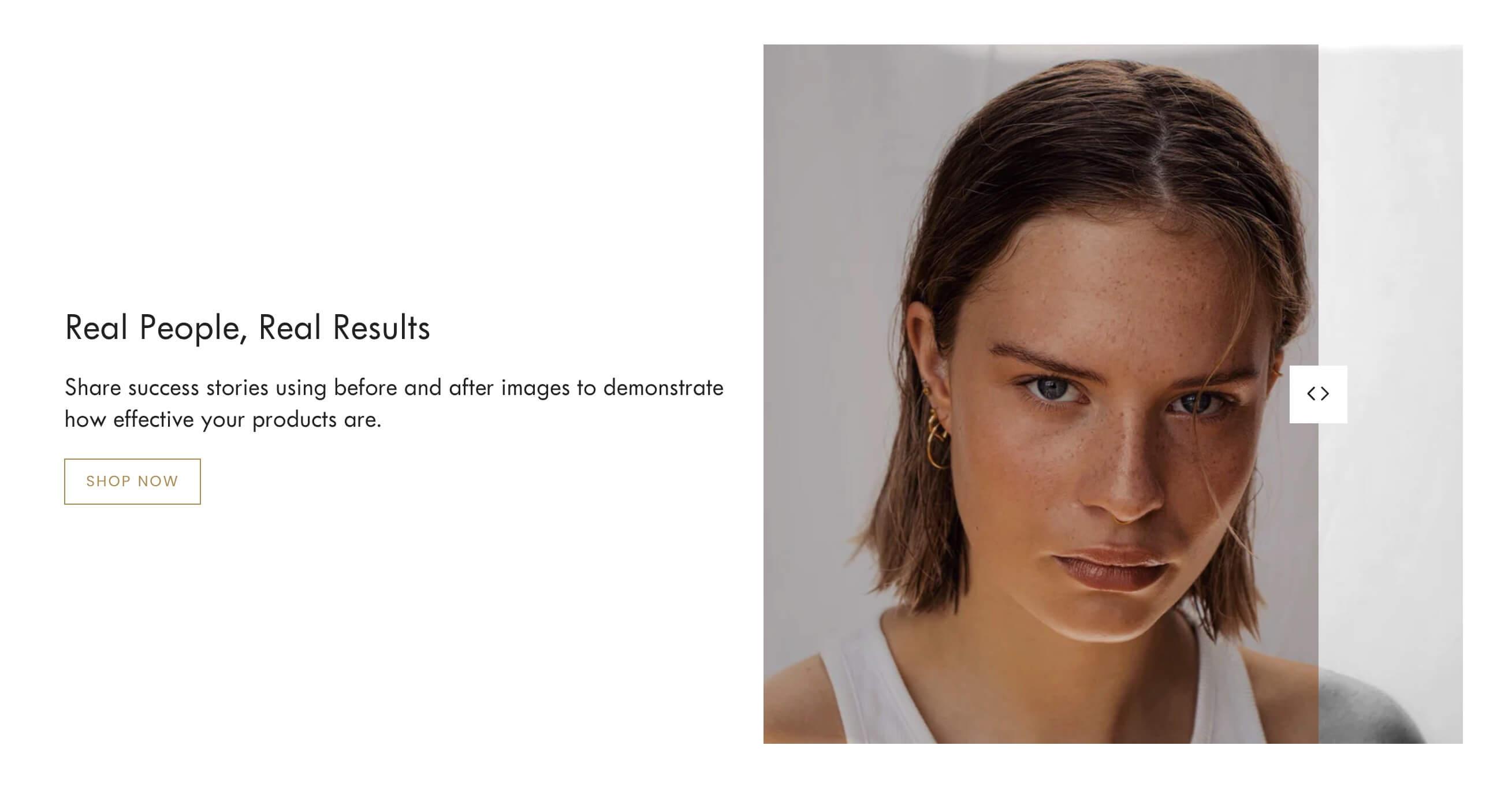
Example of the Before and after section in action
This is a good example of a theme section that can replace an app. This feature allows you to overlay two images so that the customer can compare them (e.g. how your skincare product helped a customer’s skin concern).
To achieve this you would usually either install an app (and some we’ve seen are poorly implemented) or you can have it custom-coded. Or you can just buy Broadcast.
However, while quickly testing this section we found it to be inaccessible: you can’t access the arrow button with your keyboard, let alone manipulate it. Could this section be built more semantically, with a range input for example?
Scrolling text
This is basically the same functionality as the announcement bar but you can place it anywhere on the page. It’s a nifty design tool that can serve as a divider between two image-heavy sections, for example, while reminding customers about the benefits of shopping with you.

Scrolling text on the Bright preset demo store
However, this section is not entirely accessible either. Firstly, it still animates even when we have the “Reduce motion” setting enabled on our device. Secondly, the only way to pause it is by hovering over it, so keyboard users don’t have any way of pausing it to read it. Thirdly, to make this mechanism work the “You are $100 away from free shipping.” text is cloned 12 times – and therefore read out 12 times on screen readers.
If you do use this section, note that it may be more appropriate for modern brands as it could be considered too intrusive and pushy for classic luxury brands.
Technical
Performance
As we mentioned in our previous article reviewing Prestige, Shopify does a lot of the heavy-lifting for us by leveraging browser caching, automatic minification, Gzip compression, etc.
Here are the areas we feel Broadcast does well in:
- Broadcast uses resolution switching to allow the browser to choose the right image size for the available space.
- Broadcast defers scripts that are not critical to initial render.
- Given the complexity of the theme, they do a good job in terms of reusability (e.g. use of some utility classes, or repurposing sections as snippets for additional flexibility).
What could affect performance:
- Most of the site’s CSS is bundled into a huge stylesheet that loads with every page, regardless of whether the section the CSS applies to is in use or not. Likewise with JavaScript. A more performant approach would be like Shopify’s own themes, e.g. Dawn, where the files are only loaded when the sections are actually used.
- We ran a demo homepage with a selection of 10 sections through the Shopify Theme Inspector tool and found that the total time to render Liquid was quite a bit longer than we expected (298ms) and the flame graph was running pretty deep at 16 levels. This usually means that there are lots of conditionals, nested loops and includes – but frankly this isn’t surprising given the complexity of the theme’s features. This confirms our main piece of advice with Broadcast: choose which features you use carefully.
As always, we invite you to be mindful of the apps you choose to install and the size of the media you upload to your store as these are often the biggest causes of performance issues on Shopify stores.
Accessibility
Broadcast has a relatively good foundation in terms of accessibility: there are visible focus styles, the menus can be navigated by keyboard alone, icons are labeled for screen readers, focus is managed inside modals, etc.
However, besides the section-specific accessibility issues we’ve already pointed out, there are a few other areas for improvement:
- Broadcast’s font sizes don’t adapt to users’ browser preferences. It’s best to use relative units for font sizing instead of pixels.
- Broadcast could do a better job with semantic mark-up, for example by ensuring that product grids and other list-like content use the correct list mark-up, or making use of heading levels beyond
<h2>to help users understand page content. - We’d love for the theme to respond to user-set motion preferences. Thankfully you can turn off the scroll-triggered animations in the theme settings – and maybe we all should, given that Nielsen Norman Group only recommends using them sparingly and for secondary elements.
- Ensure all form inputs have labels, e.g. the newsletter form in the footer.
SEO
SEO can be impacted by so many factors which we’ve already discussed here (user experience, performance, accessibility, not to mention type and quality of content) and some SEO functionality is provided within Shopify itself, so here we’ll focus on SEO features provided by the theme.
Structured data
Structured data gives search engines key information about a website, e.g. brand name, logo, products and product ratings, FAQs, etc. This enables search engines to then display that information in the best possible way in search results.
Broadcast takes care of all the key types of data, such as Organization, WebSite, Product and Article.
Heading hierarchy
Headings should be in a logical order for both SEO and accessibility. You should only ever have one <h1> tag per sectioning root or content section, and then you can’t skip heading levels after that (so you can’t have an <h4> without an <h3> somewhere above it).
While this depends heavily on how the theme is used and how other content on the store is configured (blog posts, pages, etc), there are some areas for improvement on Broadcast:
- On the homepage there is no
<h1>tag. A lot of other themes solve this by making the logo the<h1>. Even better, why not allow us to choose the heading level for section headings in the Customizer, like the amazing no-code platform Framer does? - Broadcast does a good job of making section titles
<h2>, but it doesn’t go much further than that. Why not make product titles in product grids<h3>? That information is, after all, pretty critical to search engines and screen readers alike.
Progressive enhancement
In our previous review of Prestige, we went into a little more detail about what progressive enhancement means and why it used to be important for Shopify themes.
Essentially, it’s making sure that a website works for the greatest number of users by using only the most basic of Web technologies, and then only using more complex technologies for the bells and whistles, i.e. features that are not critical to the main goal of the website. In the Shopify world, that can translate to ensuring that users are able to browse and shop even when JavaScript is disabled on their browser.
While there has been a recent paradigm shift at Shopify and JavaScript will, in fact, be required to check out, the methods by which we achieve progressive enhancement – writing semantic HTML and using native browser functionality – will always be a win for accessibility and performance.
And turns out, Broadcast works really well when you don’t have JavaScript: the slideshows that only work with JavaScript collapse to stacked sections, the Add to cart button still adds to cart but just redirects you to the Cart instead of displaying the cart drawer.
Developer experience
We love that Broadcast thought of developers by creating an unminified version of their main JavaScript file and allowing us to easily switch to that version in the theme.liquid file to test and debug.
We’ve been able to reuse existing functions to build out new sections and plug into custom events to detect variant changes and add-to-carts.
We also like that Broadcast uses the nice and clean BEM methodology to organize their CSS.
Summary
Broadcast is a feature-rich, well-built theme that will tick a lot of boxes for many merchants. It not only has features that a lot of other themes don’t have – and that you sometimes rely on apps to provide – but it does so in a clean and thoughtful way.
There are a few SEO, accessibility and overall usability issues to be aware of, and we would recommend steering clear of a few features that could cause the site to be unusable.
Given the wide range of features, we also recommend thinking carefully about which to use and evaluating if the benefits outweigh the possible costs on performance and usability, as well as considering if they are appropriate for a luxury audience.
If you’re looking for a theme that looks beautiful out-of-the-box and that can grow with you, give Broadcast a spin. Our clients love it – and turns out, so do we.
